CP King
(peviously CarparKing)
Design of Brand Update
CarparKing came to Graphics Unlimited to help with the update and launch of their new name and identity as CP King.
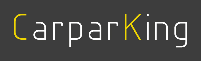
OLD CARPARKING LOGO
RE-DESIGNED CP KING LOGO
CP King being cark park specialists supplying solutions for all car parking needs, they felt that their existing branding and logo was too light and didn’t show their strength within the industry.
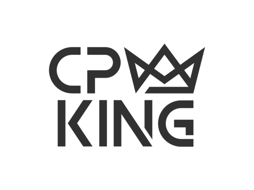
We took this and created a bold structured logo that had variations giving it the flexibility to be used across a range of items while retaining brand recognition.
ARRANGEMENT AND COLOUR VARIATIONS – Vertical, Horizontal, and an isolated symbol for flexible application
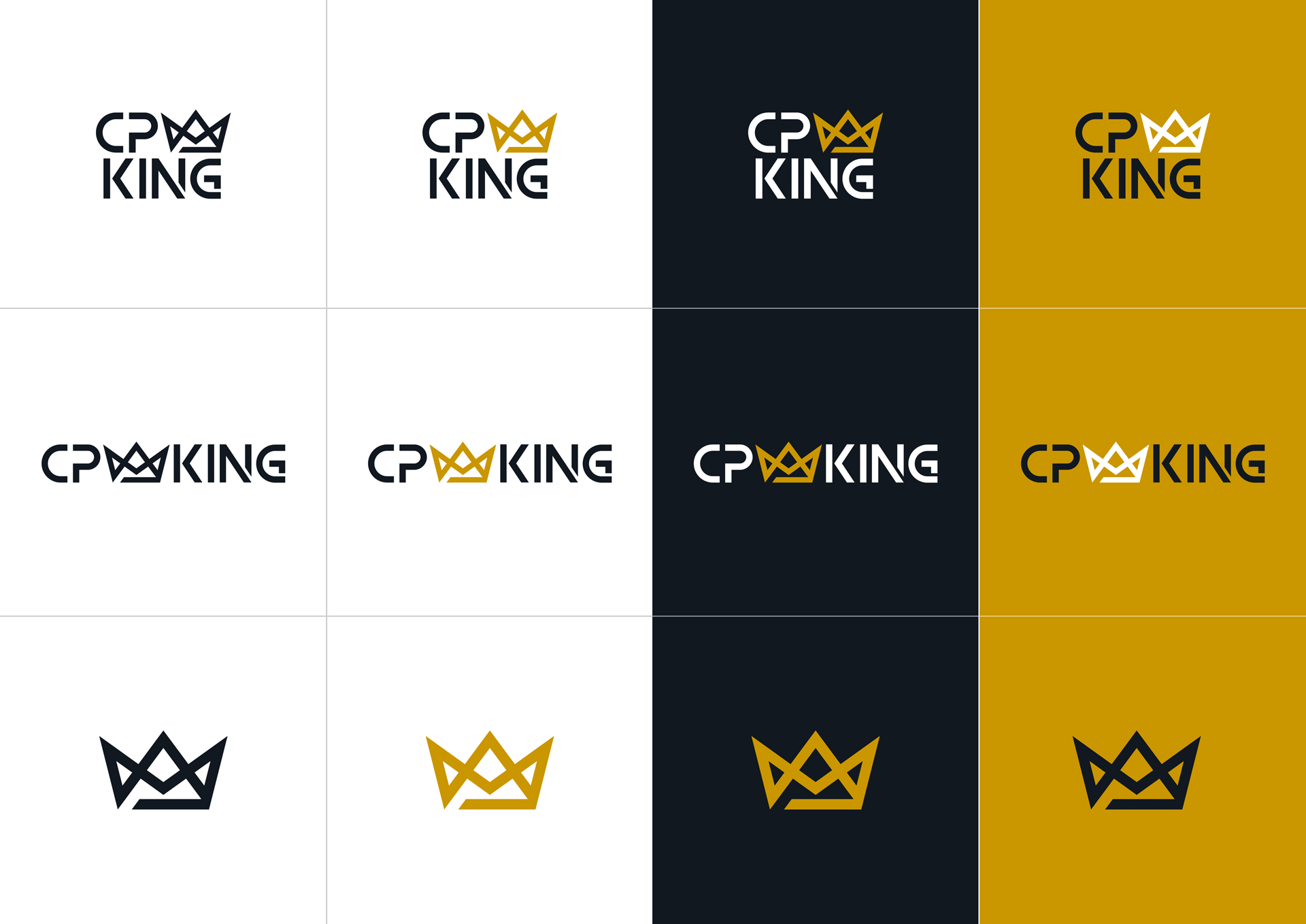
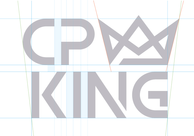
The main elements behind the new brand being stenciled text (used in line markings for car parks), dark contrast with black (representing the inside or underground of parking structures) as well as a gold crown (King, top of their market).
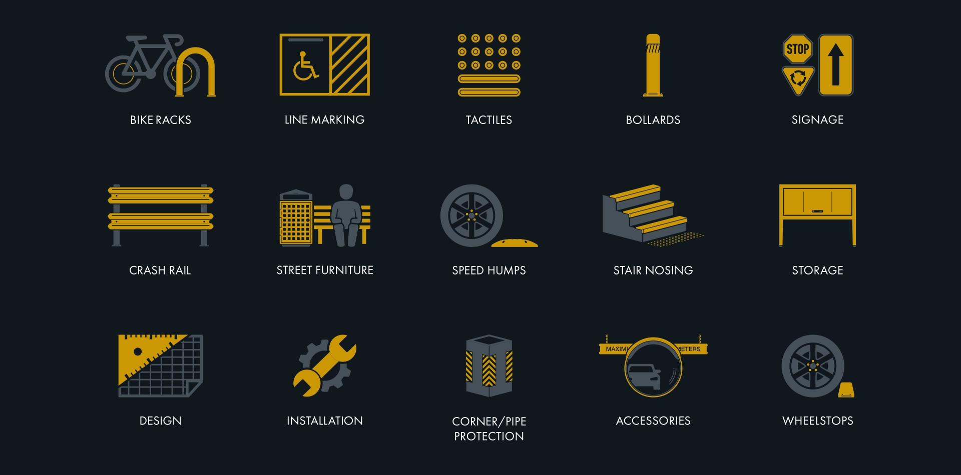
A consistent and unique icon set was also created to help CP King illustrate their product segments to their customer base in a clear and easily recognisable way. These use the dark contrast established in the look of the logo and highlight product features using the crown gold.
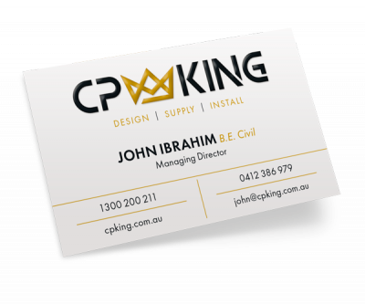
CP KING BUSINESS CARDS – FRONT
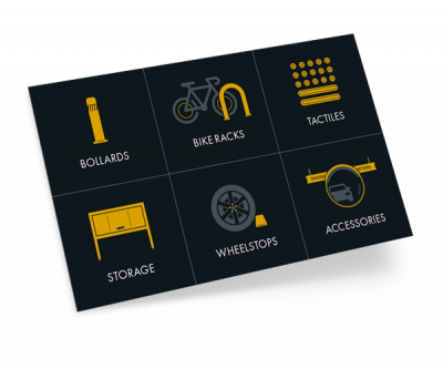
CP KING BUSINESS CARDS – BACK
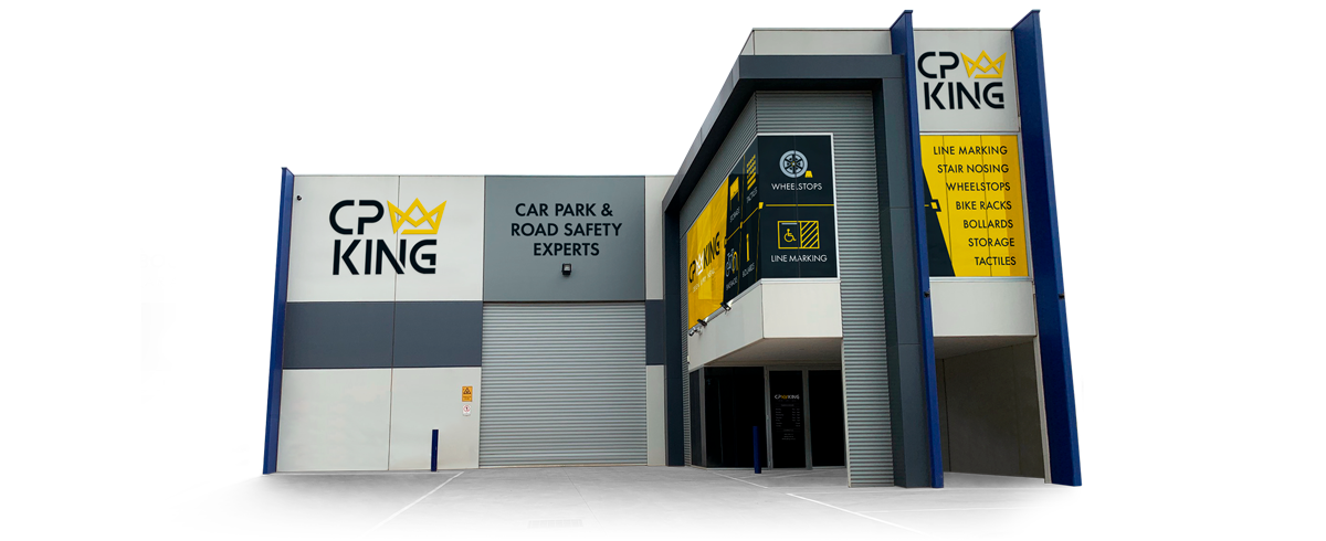
CP KING BUILDING SIGNAGE
CHECK-OUT SOME FURTHER PROJECTS BELOW: